top of page

ABOUT
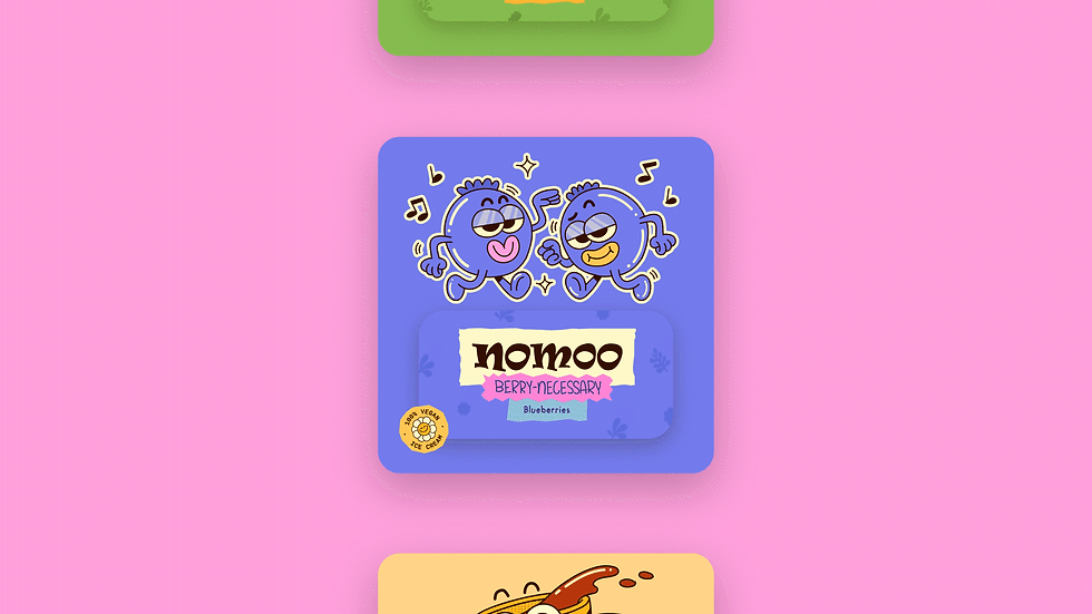
Nomoo cheekily nods to the brand’s plant-based roots, setting the tone for a fun, conscious, and flavour-packed ice-cream experience. The project explored naming, logo design, packaging, character development, and supporting collateral, building a visual identity that could feel playful across every customer touchpoint while remaining clear, distinctive, and easy to recognise on shelf.


APPROACH
The design explorations aimed to preserve the brand’s quirkiness in every element, from the wordmark to individual flavour names. Melon-choly, Berry-necessary, and Pista-la-vista turn each product into a small joke, while lively typography, bold colour combinations, and flexible packaging layouts give the range a shared personality without making every flavour look the same.

APPROACH
Character development drew inspiration from the rubber-hose animation of the 1920s, including Steamboat Willie, and the expressive visual world of Cuphead. Rounded limbs, exaggerated poses, and mischievous expressions helped create mascots that could move easily between packaging, merchandise, and campaign artwork. Together, characters, naming, and graphic system give Nomoo a nostalgic but modern identity.




bottom of page